
At the same time, Mid Century Sans has one more feature.
In the middle of the twentieth century, One big movement which called Mid-century modern had occurred. The Mid-century modern movement in the U.S. was an American reflection of the International and Bauhaus movements and it was slightly more organic in form and less formal than the International, Bauhaus-style. In other words, it was friendly and stylish.
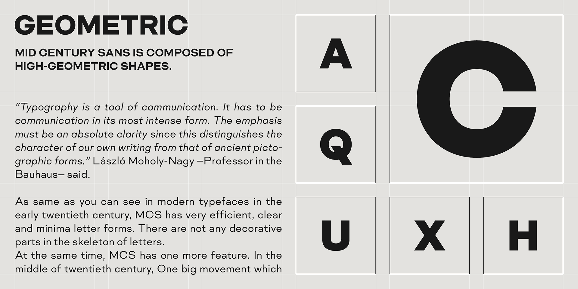
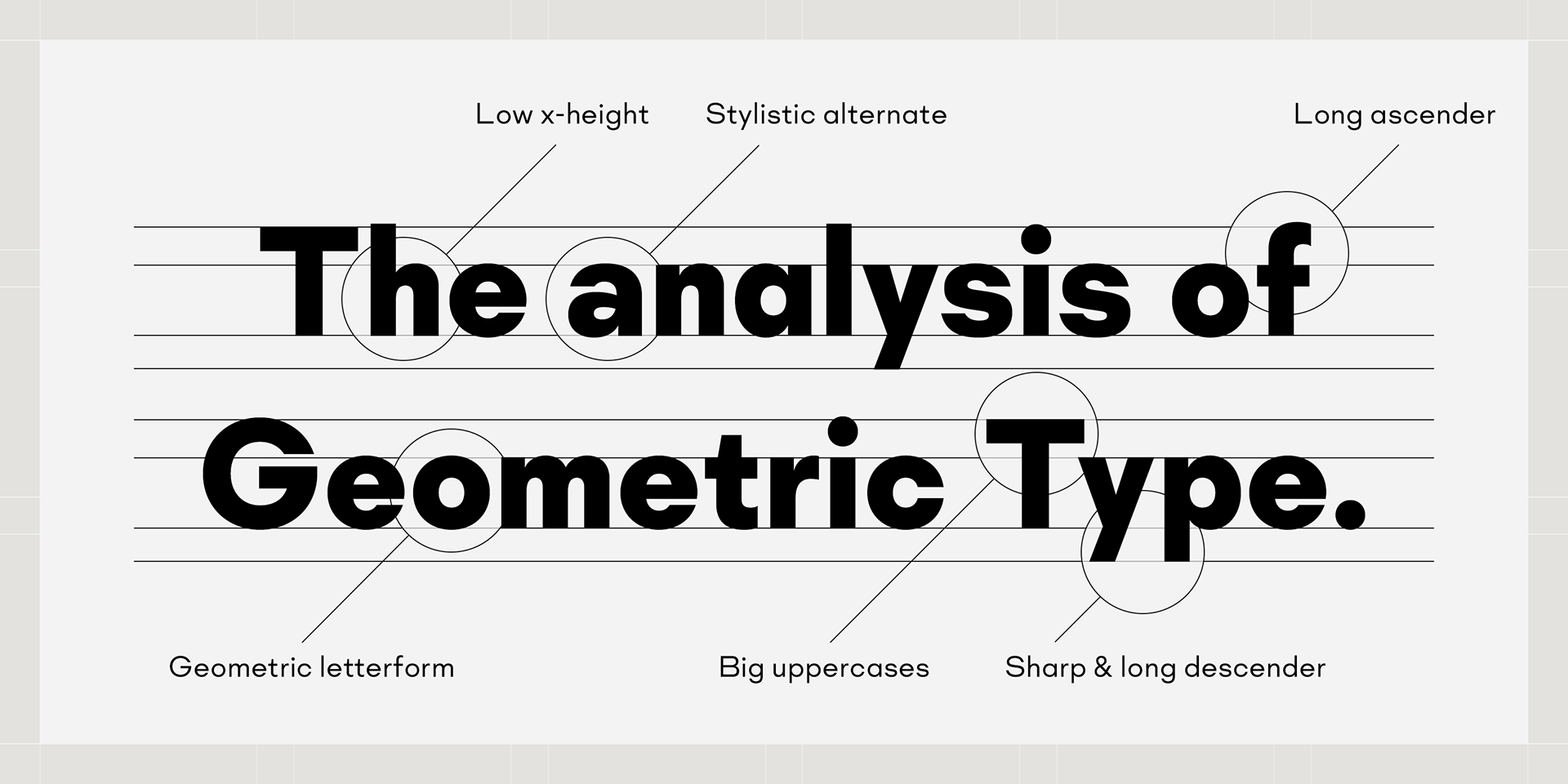
We added Mid-century-spices to the Bauhaus-modernism. The basic letter form is geometric yet it has very friendly strokes and human touch.
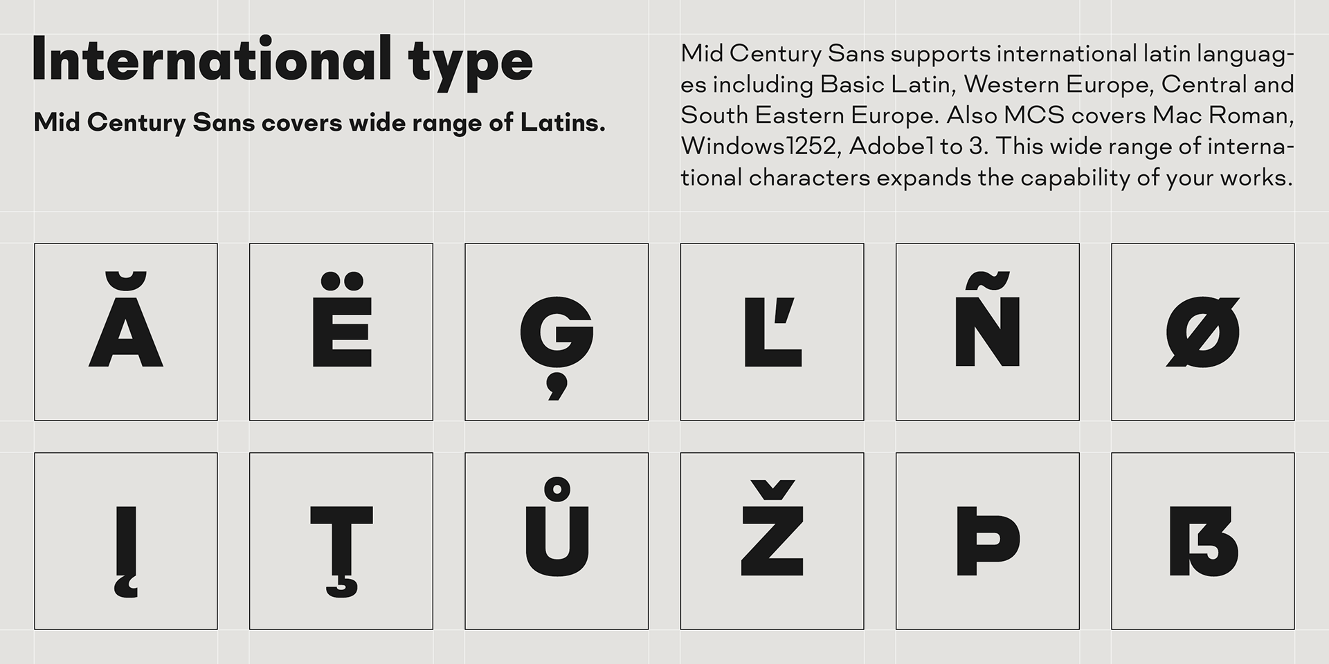
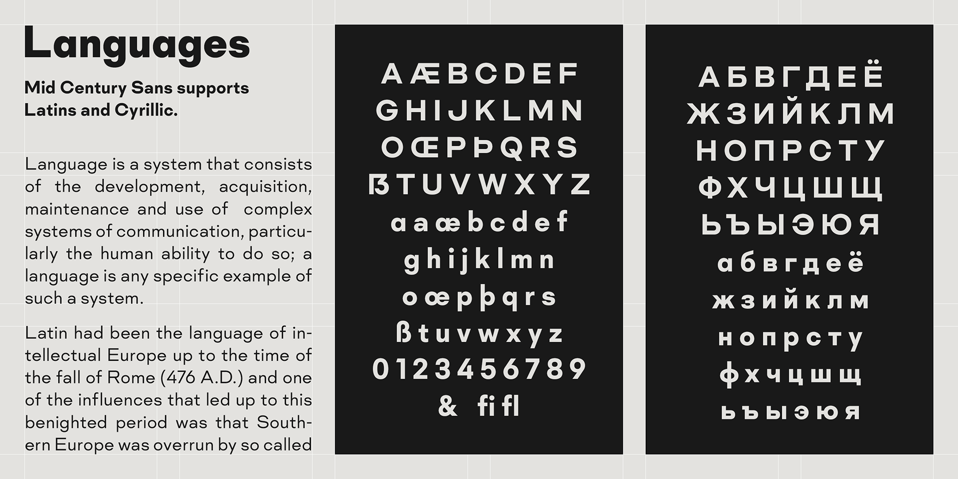
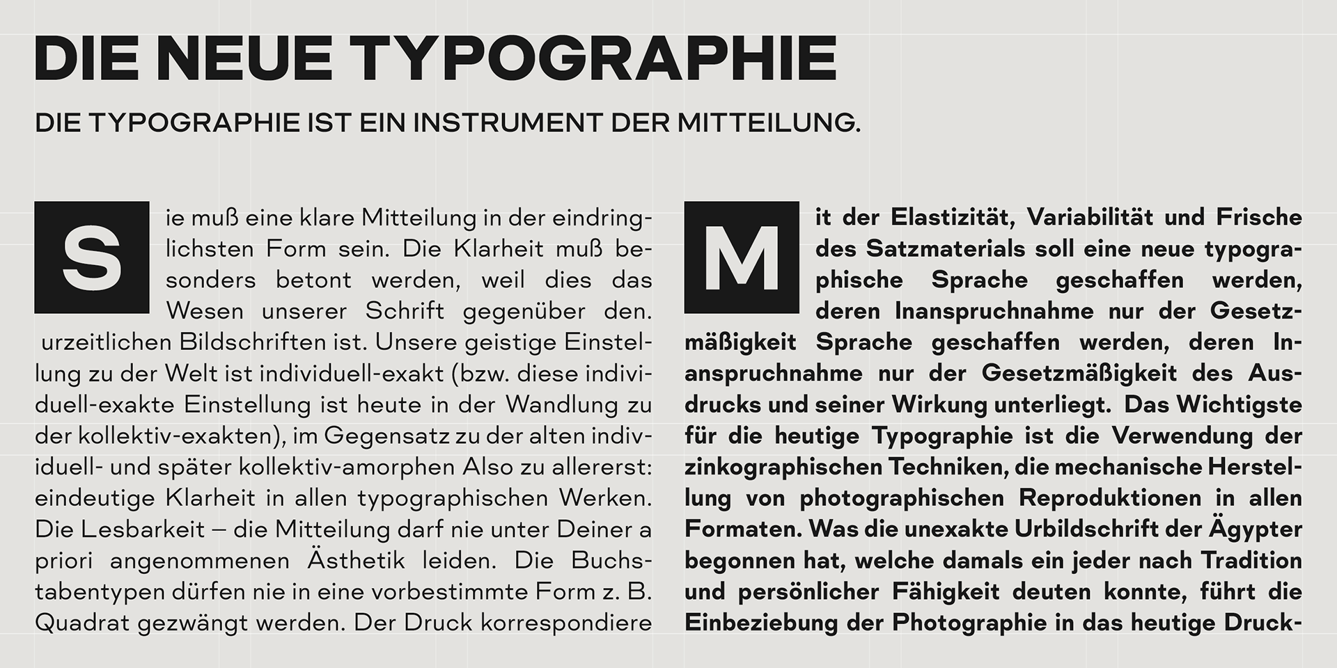
Farther, Mid Century Sans is supporting international Latin languages and basic Cyrillic languages including Basic Latin, Western Europe, Central and South-Eastern Europe. Also MCS covers Mac Roman, Windows1252, Adobe1 to 3. This wide range of international characters expands the capability of your works.
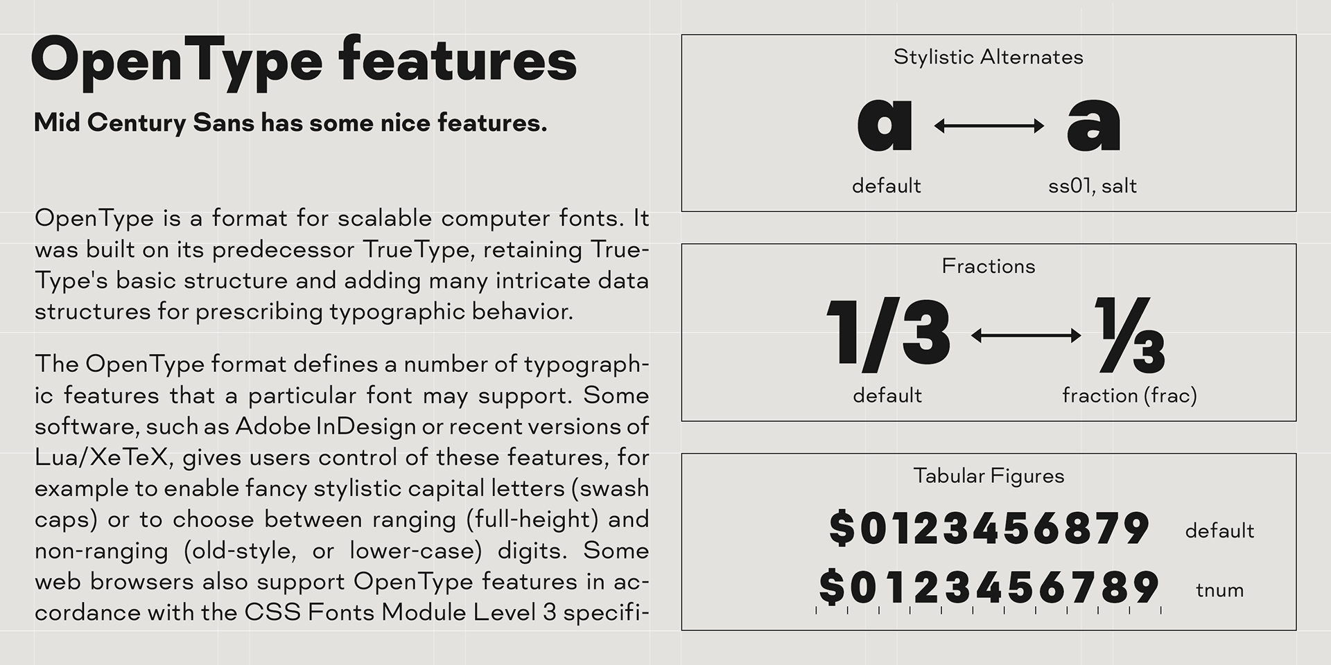
Lowercase "a" has OpenType stylistic alternate for advanced typography.