Tokyo Olive


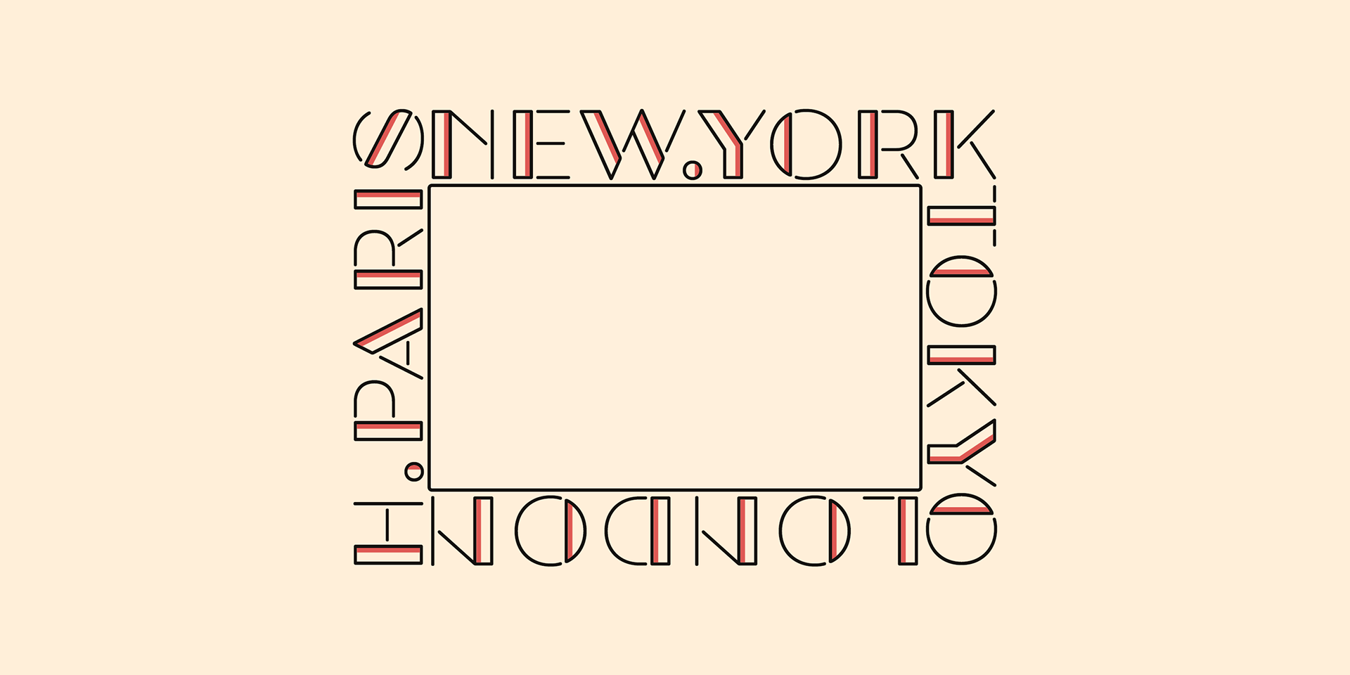
Tokyo Olive
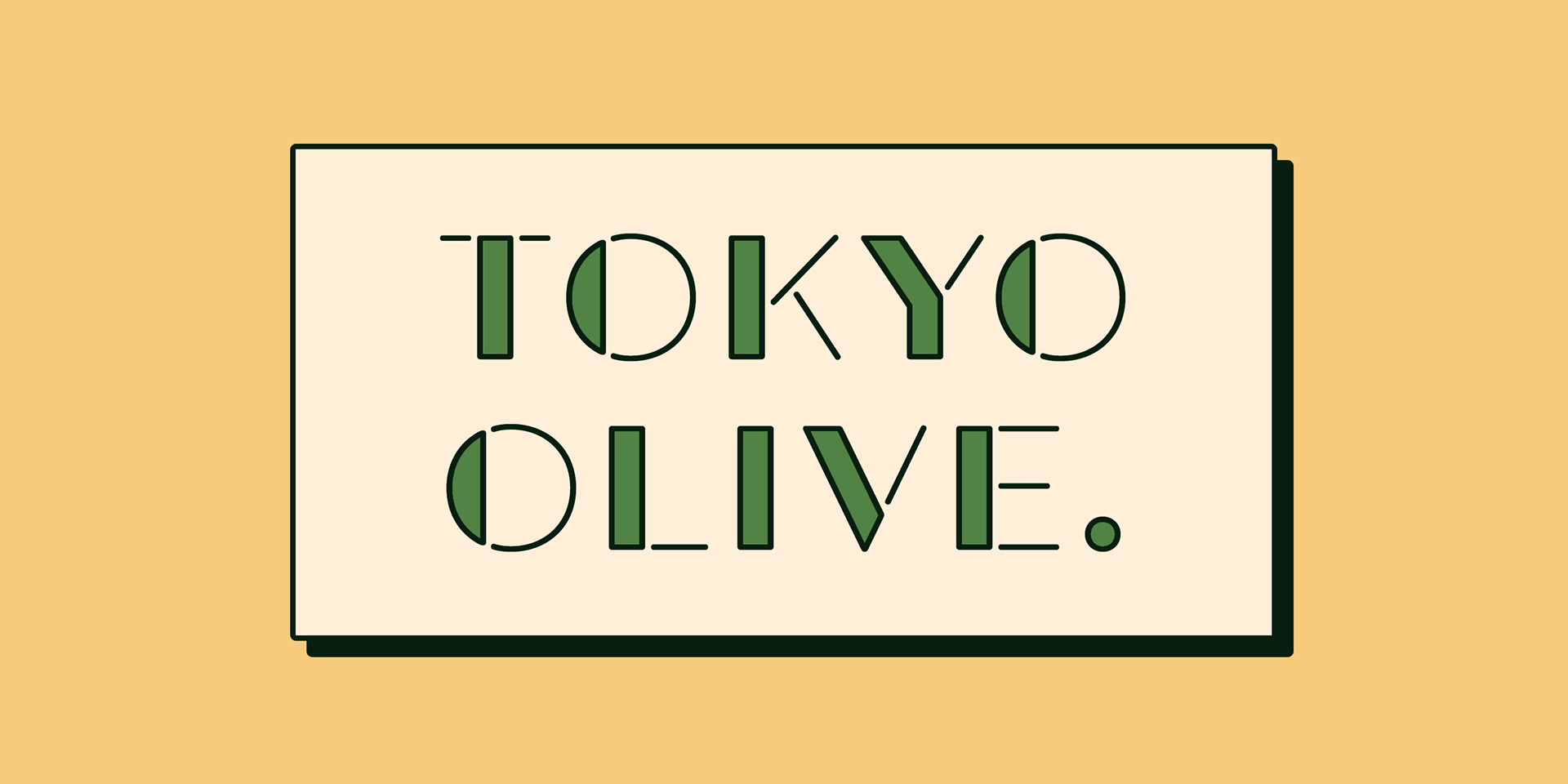
Tokyo Olive was designed as an homage to nostalgic display types and advertisements in the mid-late 80s.
The mid-late 80s was the era of the post-modernism and fancy-decorative design especially in Japan
In other words, it was the mixture of superficial form-operation and girly taste.
This curious design movement vanished without a trace in the 90s, but it had its moments.
In other words, it was the mixture of superficial form-operation and girly taste.
This curious design movement vanished without a trace in the 90s, but it had its moments.
Tokyo Olive has voluminous and simple geometric skeleton (for post-modern) with rounded and craft-style stencil joints (for fancy decoration).
We added a classic open style as a little spice. The mixture of those essences makes new impression we have never seen before.
We added a classic open style as a little spice. The mixture of those essences makes new impression we have never seen before.
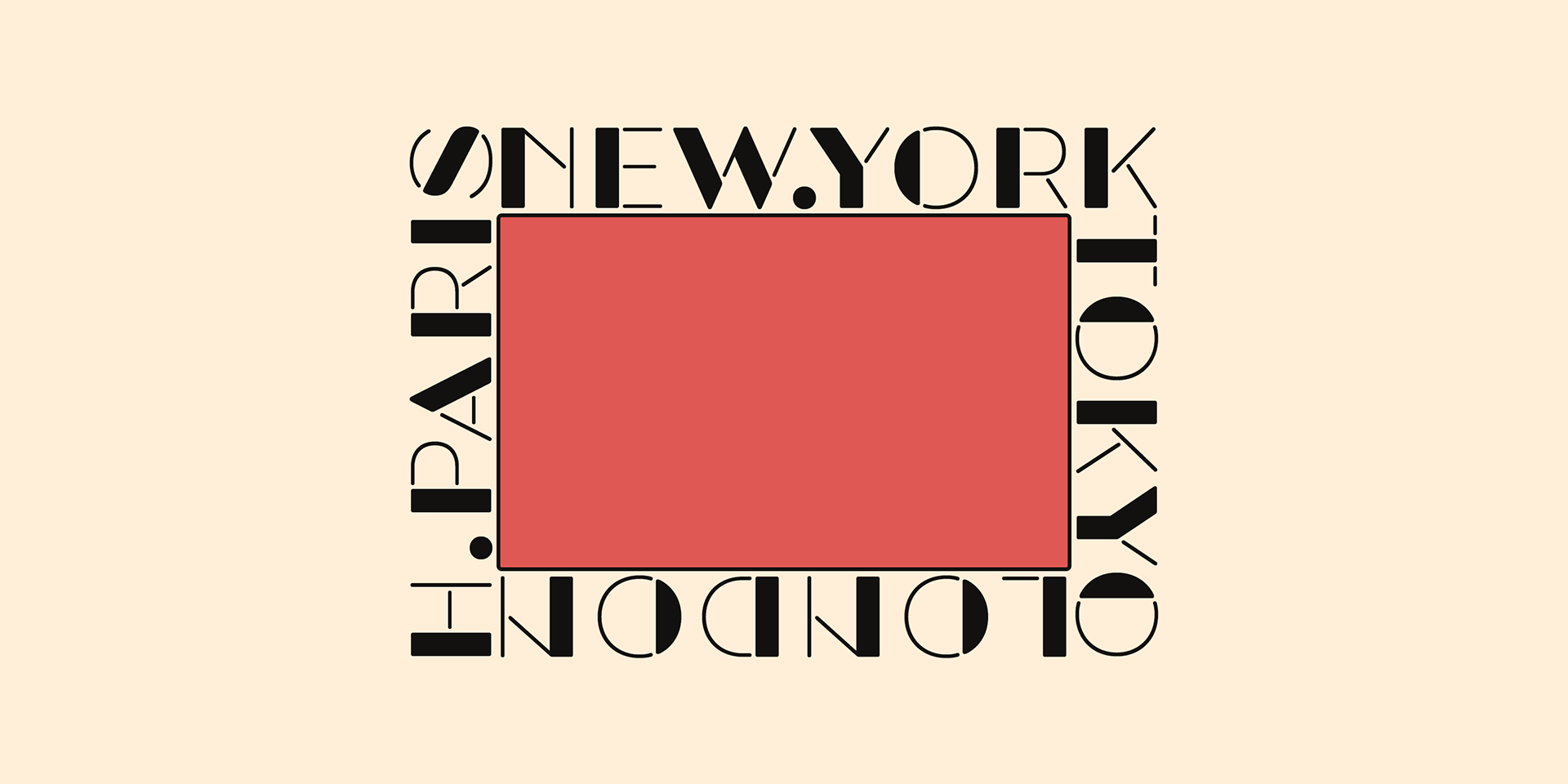
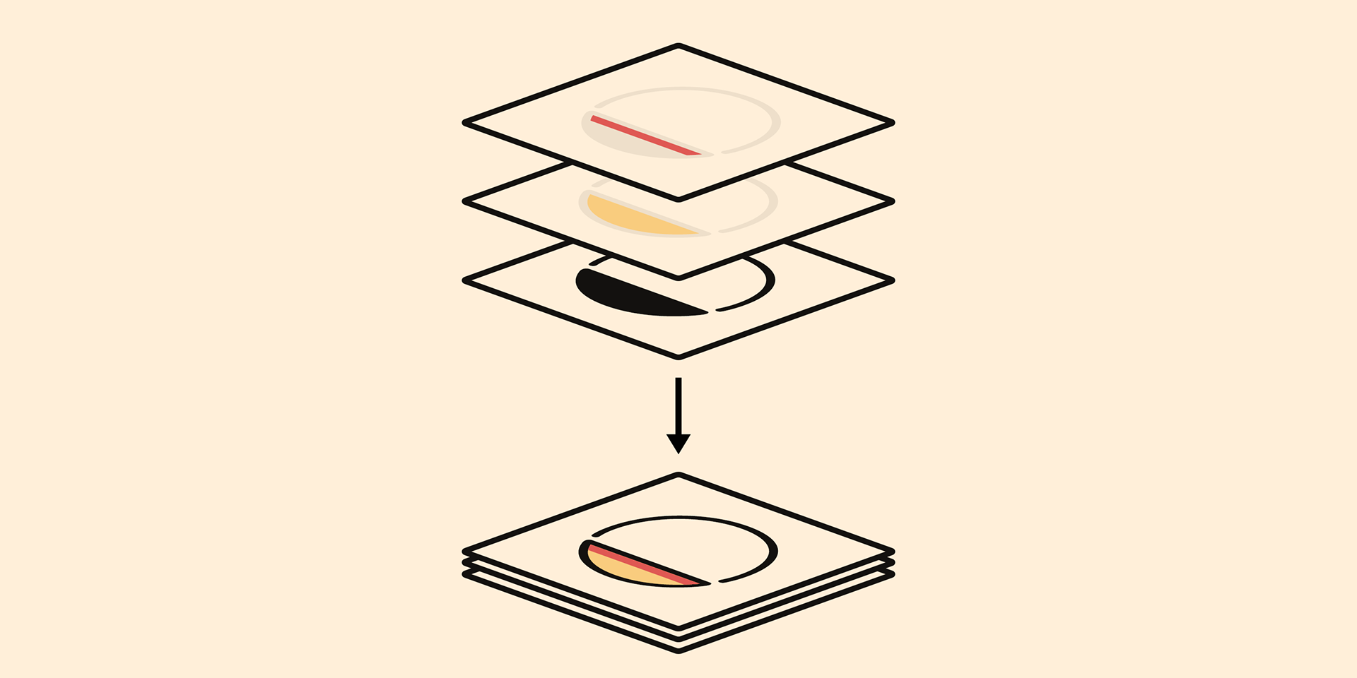
Tokyo Olive family consists of 5 styles for stacking color font.
Please use Photoshop or Illustrator, or your favorite graphic design apps that can handle layers.
Layers are the printing plates of wood type. You should be able to change text color for each layer.
Please use Photoshop or Illustrator, or your favorite graphic design apps that can handle layers.
Layers are the printing plates of wood type. You should be able to change text color for each layer.
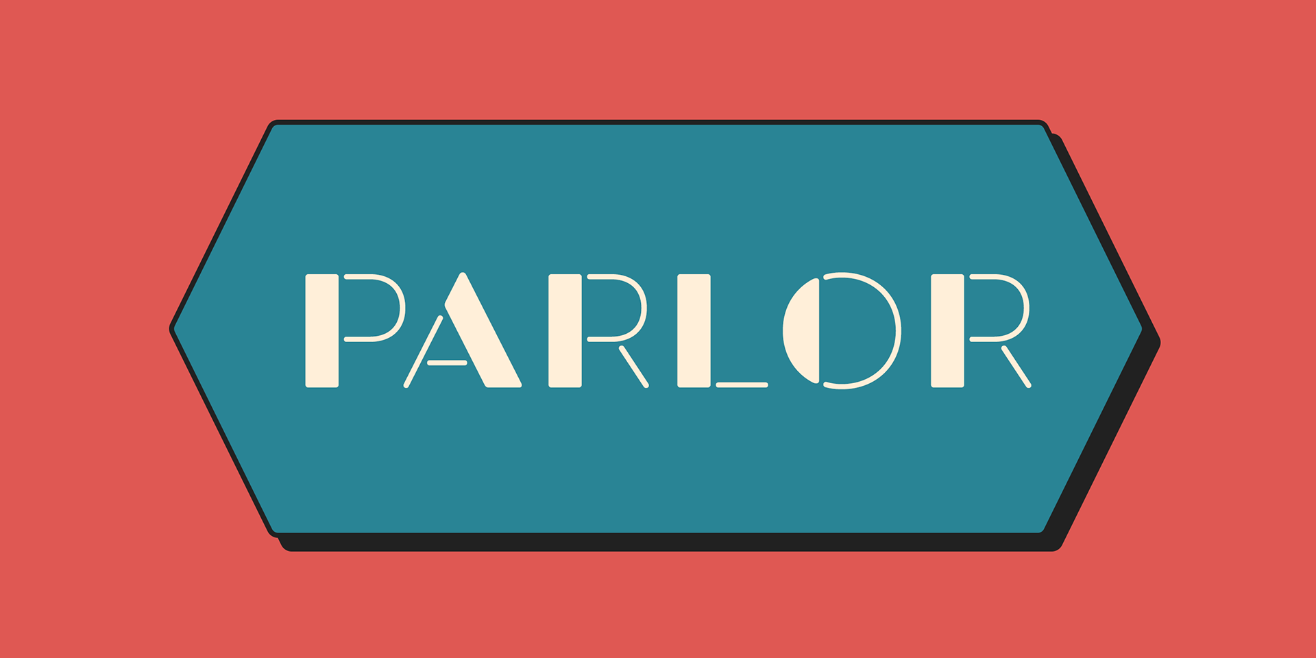
Tokyo Olive "Standard" style is the base of this font family.
You can add open effect by stacking "Fill" layers over the Standard layer.
You can add open effect by stacking "Fill" layers over the Standard layer.
Instruction
1. Type your text as you like.
2. Set font-name "Tokyo Olive" and font-style "Standard".
3. Set color of "Standard" layer.
4. Duplicate the "Standard" layer to make "Fill" layer.
5. Set font-style "Half Fill" or "Full Fill" and new color of upper layer.
1. Type your text as you like.
2. Set font-name "Tokyo Olive" and font-style "Standard".
3. Set color of "Standard" layer.
4. Duplicate the "Standard" layer to make "Fill" layer.
5. Set font-style "Half Fill" or "Full Fill" and new color of upper layer.
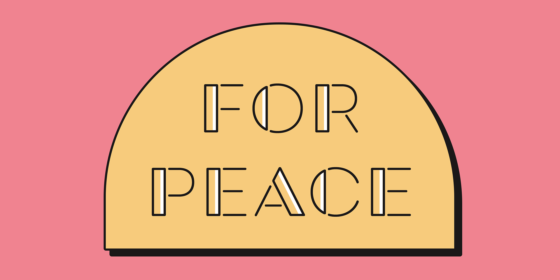
Tokyo Olive Standard, Half Open, and Full Open style can be used solely.